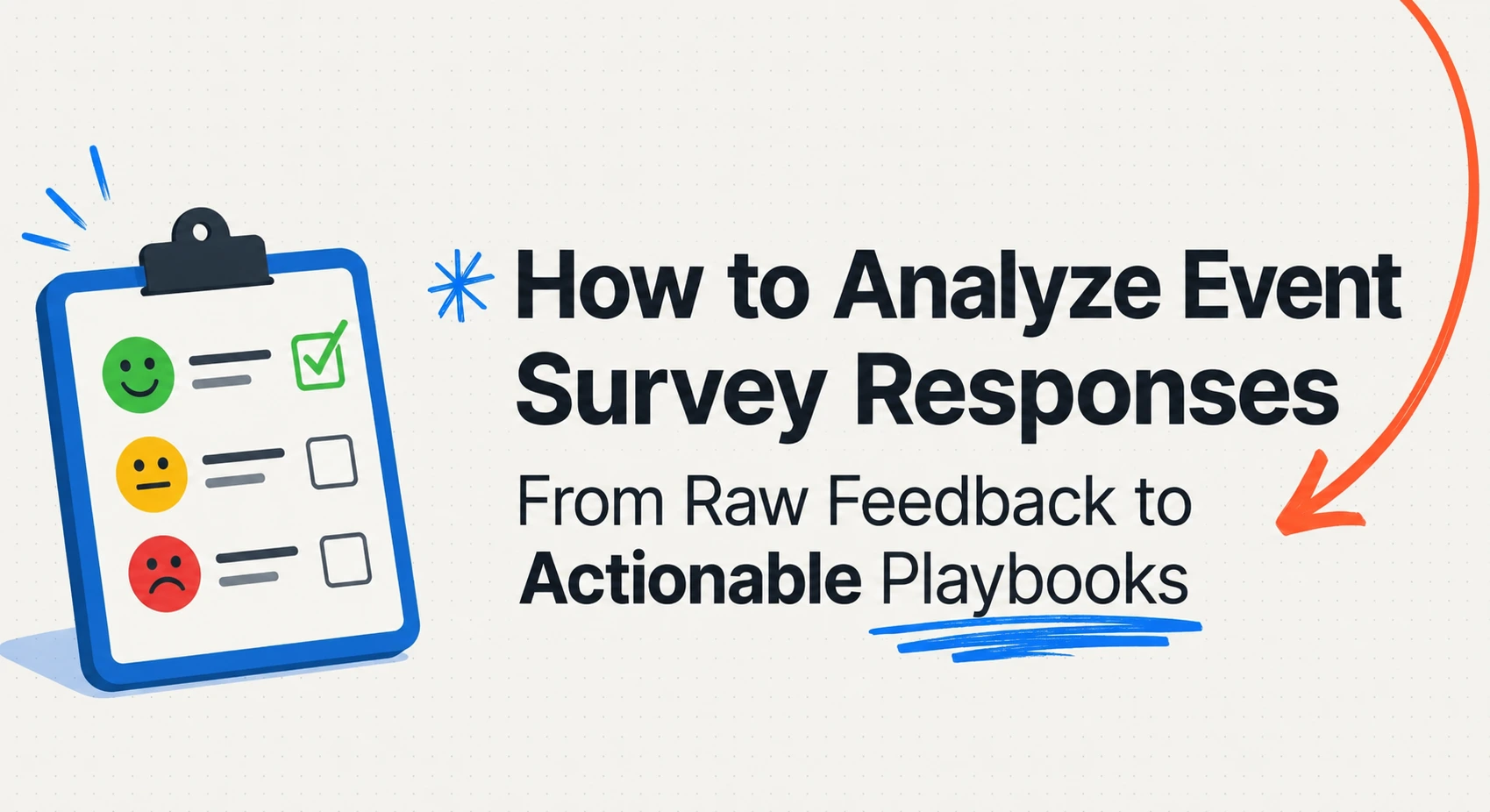
Key Takeaways: To analyze survey responses from an event, separate quantitative ratings from qualitative comments and evaluate each using the right method. Start by cleaning and consolidating your data, since duplicates, blank submissions, and test entries can quietly distort results. Quantitative scores reveal what happened, while open-ended responses explain why it happened. Group comments into recurring themes and assess sentiment to identify patterns at scale. For the most accurate insights, connect survey feedback with attendance, registration, and historical event data. Ticket Generator helps organizers collect feedback and export clean event data for deeper analysis.
Did You Know? A good post-event survey response rate for conferences and corporate events is typically just 10–20%. This means most organizers are making decisions based on feedback from only a small portion of attendees, making it even more important to analyze responses carefully and look for consistent patterns. Source:
Explori.
Because so few attendees actually fill out your survey, every response you get is precious. And most organizers waste them by skimming a satisfaction average and moving on. Knowing how to analyze survey responses from an event is what separates a survey that gathers dust from one that shapes your next event.
The short answer: consolidate and clean your responses, split the quantitative ratings from the open-ended comments, analyze each with the right method, segment by attendee group, compare against past events, and convert the findings into a concrete action list. That sequence works whether you ran a webinar, a trade show, or a charity gala.
In this guide, we explain what survey analysis really involves, walk through the seven-step process, cover the metrics that matter most, show how analysis shifts by event type, and flag the mistakes that quietly ruin good data.
What does it mean to analyze survey responses from an event?
Analyzing survey responses from an event means turning raw feedback (ratings and written comments) into clear insights you can act on. It is the difference between “people seemed happy” and “82% rated the venue highly, but check-in was the top complaint.”
Event survey data comes in two flavors, and each needs a different lens:
Quantitative data — closed questions with countable answers: star ratings, 1–10 scales, multiple choice, yes/no, NPS, and CSAT. This is your “what.”
Qualitative data — open-ended text where attendees write freely: “What could we improve?” This is your “why,” and it is where the real insight usually hides.
Numbers tell you a session scored 3.2 out of 5. The comments tell you it ran 40 minutes over and lost the room. You need both: the quantitative side shows the scale of an issue, and the qualitative side explains the cause.
How do you analyze survey responses from an event step by step?
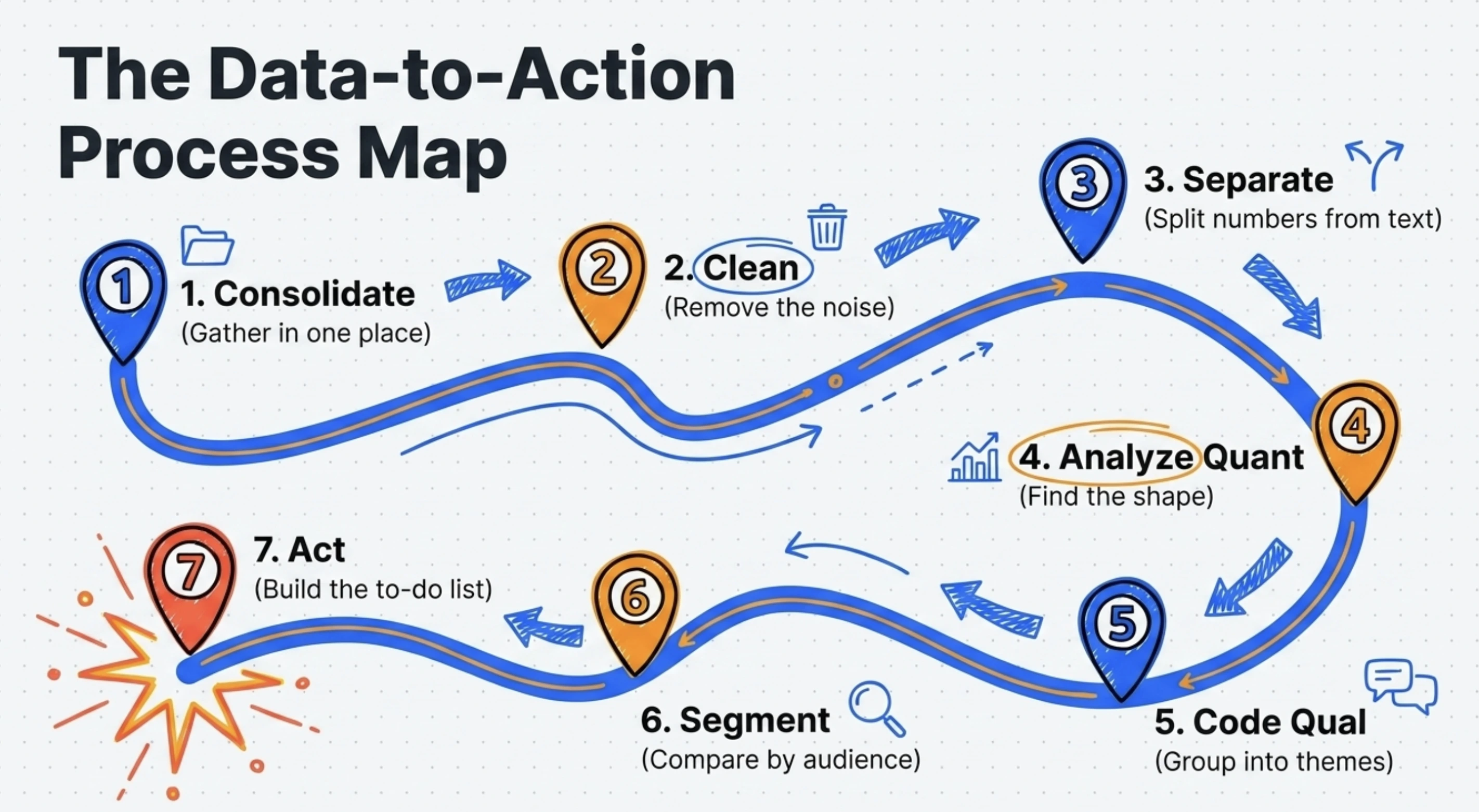
Follow seven steps: consolidate your responses, clean the data, separate the two data types, analyze the quantitative answers, code the open-ended ones, segment by audience, and turn it all into actions.
1. Consolidate every response in one place
Pull all responses into a single spreadsheet or dashboard before you analyze anything. If feedback is scattered across email replies, a form tool, and on-site comment cards, you will double-count some attendees and miss others entirely.
2. Clean the data
Remove the noise before it distorts your results. Specifically:
Delete duplicate submissions from the same attendee.
Drop blank or near-empty responses that add no signal.
Remove your own test entries and obvious spam.
Standardize formats (dates, ticket types, ratings) so they sort correctly.
3. Separate quantitative from qualitative
Split your closed-question answers from your open-text answers into separate columns or tabs. They are analyzed with completely different methods, and mixing them is the most common reason analysis stalls.
4. Analyze the quantitative answers
Start with the countable data, because it is fast and gives you the shape of the event:
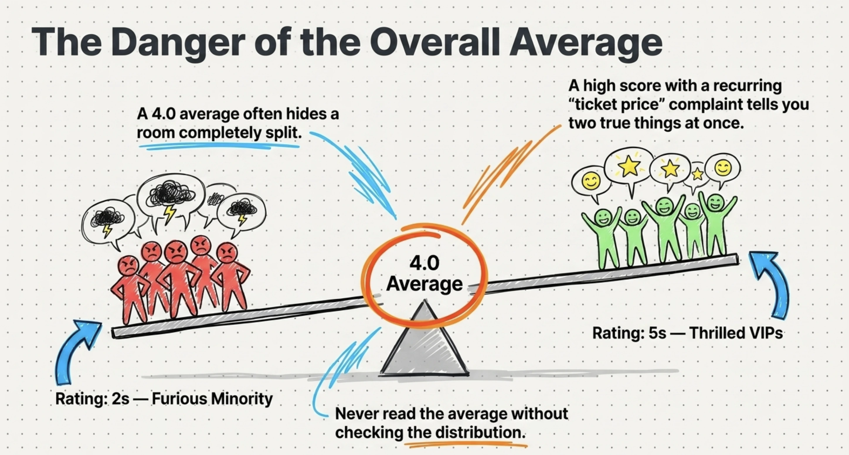
Calculate averages and the full distribution, an average of 4 hides a room split between 5s and 2s.
Convert ratings into percentages (“78% rated catering 4 or 5”) for easy reporting.
Compute headline metrics like NPS and CSAT (defined in the next section).
Cross-tabulate: filter scores by ticket type, day attended, or session to find who felt what.
Did You Know? Email-based NPS surveys average only about 12.4% response rates. With so few people responding, segmenting feedback by attendee type, ticket category, or customer cohort becomes far more valuable than relying on a single overall score. Source:
CustomerGauge
/ Stripo (2025).
5. Code the open-ended responses into themes
Read the comments and tag each one with a short theme label: “check-in,” “venue,” “speaker quality,” “price.” Once tagged, you can count how often each theme appears and rank attendee concerns by volume instead of guessing.
Two techniques make this manageable at scale:
Thematic coding: Group comments into recurring themes so 300 free-text replies become 8 clear topics.
Sentiment analysis: Mark each comment as positive, negative, or neutral, then layer it over your themes to see which topics drive frustration versus praise.
Pro Tip: Export your registration responses and attendance data from
Ticket Generator's event attendance tracking
as Excel files, then place your survey themes alongside them. This lets you identify whether your strongest critics were first-time attendees, returning guests, VIP ticket holders, or no-shows who later rebooked. The combination of attendance and feedback data often reveals patterns that survey results alone cannot.
6. Segment by attendee group
Break results down by audience instead of reading one blended number. VIP and general-admission guests often experience the same event very differently, and a strong overall score can mask a struggling segment.
Useful segments include ticket type, first-time versus returning attendees, session or track attended, and registration channel.
7. Turn insights into an action list
Finish every analysis with a short list of specific, owned actions, not observations. “Satisfaction was 4.1” is a finding; “Add a second check-in lane because 22% of comments named entry delays” is an action. The action list is the entire point of the survey.
If you are pulling this together into a wider recap, our guide on how to create an event report shows how survey findings fit alongside attendance and revenue data.
Pro Tip: Collect cleaner feedback from the start. Use Ticket Generator to register attendees, send post-event survey links, and export tidy event data you can actually analyze. Your event. Your data. Your rules.
Which metrics matter most when analyzing event survey data?
The metrics that matter most are NPS, CSAT, overall satisfaction, likelihood to return, and the top open-text themes. Each answers a different question about your event.
Metric
What it tells you
How to read it
NPS (Net Promoter Score)
Whether attendees would recommend your event
% promoters minus % detractors; track the trend, not just the number
CSAT (Customer Satisfaction)
Satisfaction with a specific element (venue, speakers, food)
Percentage of respondents who rated 4–5 on a 5-point scale
Overall satisfaction
The big-picture verdict on the event
Read the distribution of scores, not only the average
Likelihood to return
Predicted repeat attendance for recurring events
Segment results by first-time vs. returning attendees
Session / speaker ratings
Which parts of the program worked
Rank sessions and pair low scores with attendee comments
Top open-text themes
The reasons behind every score above
Count theme frequency and tag sentiment to identify patterns
Resist the urge to crown one “north-star” number. A high NPS with a recurring “ticket price” complaint theme is telling you two true things at once, and you need both to plan the next event.
Set Up Event Ticketing and Distribution in Minutes!
First 10 tickets free | Free account | No credit card required
The analysis method stays the same (clean, split, score, code, segment, act) but the questions you prioritize and the benchmarks you compare against change with the event's goal. A networking mixer and a product launch are not judged by the same yardstick.
Event type
Primary goal
Metrics to prioritize in analysis
Conference
Knowledge and program value
Session/speaker ratings, NPS, likelihood to return
Lead quality, exhibitor satisfaction, intent-to-rebook
Product launch
Awareness and purchase intent
Message recall, purchase intent, sentiment themes
Marketing campaign event
Brand lift and conversions
Brand perception, conversion-driver themes, CSAT
Sales promotion
Conversion and offer appeal
Offer clarity, purchase intent, objection themes
Customer appreciation
Loyalty and relationship
NPS, sentiment, “feel valued” themes
Networking event
Useful connections made
Connections made, format rating, likelihood to return
Team building
Cohesion and morale
Engagement, perceived value, open morale comments
Charity / fundraiser
Donor experience and giving
Donor satisfaction, NPS, intent to give again
Notice the pattern: outcome-driven events (trade shows, launches, promotions) lean on intent and conversion signals, while relationship-driven events (appreciation, networking, charity) lean on NPS and sentiment. Identify your event's one true goal first, then weight your analysis toward the metrics that prove it.
Whatever the event, your analysis is only as good as the questions you ask. If you are designing the survey itself, start with our post-event survey questions, and for expectations set before the doors open, the pre-event survey questions guide pairs neatly with it.
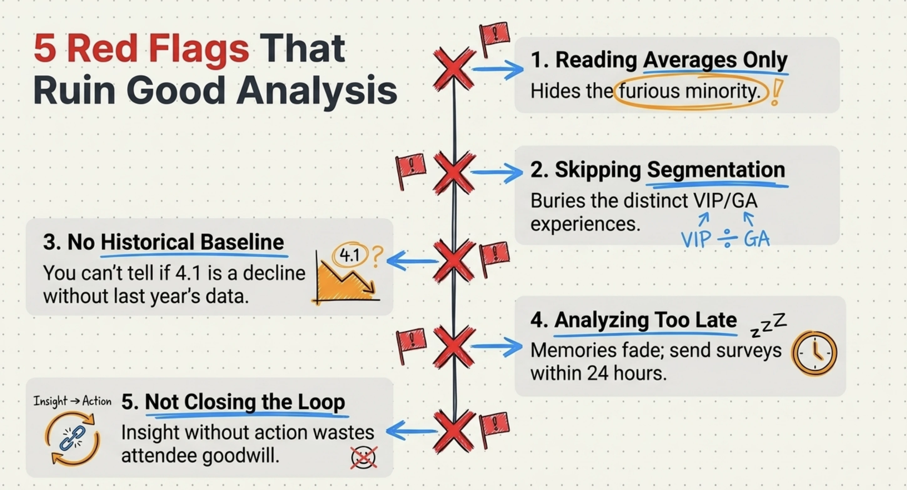
What are the most common mistakes when analyzing event survey responses?
The biggest mistake is ignoring open-text comments because they are harder to count. A few more reliably sink good analysis:
Reading averages only. A 4.0 average can hide a furious minority. Always check the distribution.
Skipping segmentation. One blended score buries the experience of VIPs, first-timers, or a single bad track.
No baseline. Without last year's numbers, you cannot tell if a 4.1 is good or a decline.
Analyzing too late. Memories fade fast; send the survey within 24 hours and analyze within the week.
Not closing the loop. Insight with no action and no follow-up to attendees, wastes the goodwill of everyone who replied.
How Ticket Generator helps you collect and analyze event survey responses?
Ticket Generator is built for organizers who want clean, owned event data, which is exactly what good survey analysis depends on. It does not replace your statistical work, but it removes the messy collection and exporting steps that usually corrupt the data before you even start.
For the survey workflow specifically, you can:
Capture structured feedback at registration using customizable registration pages with custom fields. This is useful for pre-event expectations and consent to follow up.
Send post-event surveys with built-in Campaigns: Ticket Generator's native email marketing lets you build subscriber lists and trigger-based emails to share your survey link, with no separate tool.
Export clean attendance and registration data as Excel or PDF, so you can cross-reference who actually showed up against what they said.
Compare events over time by cloning recurring events and tracking attendance rate, conversion rate, and page visits in one dashboard.
That “compare over time” ability is where recurring organizers win. Heartland Emmys has run its events on Ticket Generator across four consecutive years, generating 3,433+ tickets over 10+ events, the kind of consistent, exportable record that turns a single survey into a multi-year trend line.
More than 1,000,000 tickets across 30,000+ events in 100+ countries have run through the platform, so the export formats and attendance metrics you feed into your analysis are battle-tested. In short, Ticket Generator gives you the clean inputs; your seven-step process does the rest.
Conclusion
Analyzing survey responses from an event is not about finding one flattering number. Tt is about reading the numbers and the comments together, segmenting honestly, and comparing against your own history.
Yes, response rates are low and clean data takes effort. But the seven-step process (consolidate, clean, separate, score, code, segment, act) works for any event, from a webinar to a charity gala. The payoff is a short, specific action list that makes your next event measurably better.
And it all starts with clean collection, which is where the right ticketing and registration platform quietly does half the work for you.
Pro Tip: Try Ticket Generator to register attendees, send post-event surveys through built-in Campaigns, and export tidy event data you can actually analyze. Your event. Your data. Your rules.
Set Up Event Ticketing and Distribution in Minutes!
First 10 tickets free | Free account | No credit card required
1. What is the best way to analyze open-ended survey responses from an event?
Code them into themes, then add sentiment. Read each comment, tag it with a short label like “check-in” or “venue,” and count how often each theme appears. Layer positive/negative/neutral sentiment on top so you can see which topics drove frustration versus praise.
2. What is a good response rate for a post-event survey?
For conferences and corporate events, 10–20% is considered good, and around 12–15% for live trade shows, according to event research firm Explori (2026). Because rates are low, focus on analyzing the responses you get carefully rather than chasing a higher count.
3. How soon after an event should I send the survey?
Send it within 24 hours, while the experience is fresh. Response rates and answer quality both drop sharply as memories fade, so a fast, short survey beats a delayed, detailed one.
4. What is the difference between quantitative and qualitative survey data?
Quantitative data is countable: ratings, scales, and multiple choice that tell you what happened. Qualitative data is open-ended text that tells you why. You need both: numbers show the scale of an issue, and comments explain the cause.
5. Can Ticket Generator collect and analyze event survey responses?
Ticket Generator collects feedback through custom registration fields, sends survey links via built-in Campaigns, and exports clean attendance and registration data as Excel or PDF. You then run your analysis on that exported data, cross-referencing what attendees said against who actually attended.
Ashish Chandra has spent 5+ years writing about event technology, covering topics such as ticket design, QR check-ins, attendee management, and event marketing strategy. As the Content Lead at Ticket Generator, Ashish has analyzed hundreds of real-world event workflows and ticketing setups, helping organizers across industries use QR-based tickets, event landing pages, and smarter ticketing systems to run smoother, better-attended events.
His writing is shaped by real user needs and the questions organizers ask most often: How do I sell more tickets? How do I avoid chaos at the door? How do I make my next event better than my last?
When he steps away from the screen, you'll likely find him hiking a quiet trail or tending his plants- his preferred way to reset.


.png)